So I love seeing how everything comes together at the last minute. So I purposely took photos of all the facades when I stopped by on Friday afternoon at like 3ish and then again when I was at the carnival on Saturday. It amazes me how much changes in those 17 odd hours between 3pm and 8am the next morning.
AEPhi/Theta Xi
Retro Gas Station
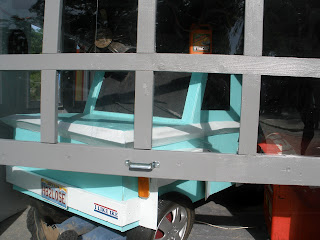
Here is their facade on Friday afternoon. I liked this one from the beginning, the colors were really nice and bright and it was very clean. I really liked their garage (there is a car made out of wood in there, that's pretty darn impressive)
I was curious to see how they were going to decorate a gas station, and you'll see in the photos below how great of a job they did.

And then here is their facade during the carnival. It really came together with all the little details on it. Also, major plus of building a gas station? You can just store all the tools in the facade, no need to lug everything off the lot on friday night. They had tons of tools hanging on the wall and in the garage.
Here is a better photo of the car. Its the little details of this that I loved. Like the bumper sticker and the guy under the car. I pulled him out because I wanted to see how they did it. They stuck 2x4s down the jeans and into the shoes. Brilliant!
The front was great. I like that they had windows in their facade that you could actually see through. Then all the little details with the signs and the ice chest were great. And it was all really clean.
They had 4 of these gas pumps which were pretty great. Overall, really impressed with how this facade turned out.
KKG and Kappa Sig
Kitchen/Refrigerator
This one really came together on the last night. It took until Friday for me to even understand what they were planning to do with it. But all I figured out was that the cabinets were going up and that the fridge door was the thing on the corner that you would walk through to get into the facade.
This is the final product on Saturday during the carnival. It was interesting because everything was soooo large. I liked the oven and the giant skillet. But I like bright colors, and a kitchen could be bright, but this one wasn't.
The fridge turned out pretty cool. I wander how they got it to look so shiny and reflective. But overall the sizing and proportions of everything seemed a little off.
The other thing I really liked were some of their details. On that shelf they had different food products that they had changed to reference the sorority of fraternity. Like the book of Sigma K. How Clever!
AOPi
Pirate Ship
This was AOII pirate ship on Friday afternoon. I majorly failed and didn't grab a photo of the final project. But it ended up looking really great. AOII is the only group that does it on their own without a fraternity, so its a challenge with half the money and half the people to help with the facade. So even though it isn't a full facade like the other ones, it really looked great!
They even had a working fountain surrounded by greenery, so impressive!
Alpha Phi/SAE
House of Cards
This is the photo taken Friday afternoon. Their theme was house of cards. A very cool element was the stacks of cards on the sides, but I was curious to see what else they were going to add.
You can see in the photo below that not much got added to the outside in the last night, but their inside was very cool (I didn't take a photo of it!) They had an entire wall of the back of playing cards. And then the rest of it kind of looked castle-like.
AEPi/PiPhi
Toy Box
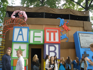
Here is theirs on Friday. The blocks were cool and very colorful, but it seemed like it needed a lot more of something to make it obvious that it was a toy box. They did what I thought they needed! They had a lot of large toys that they put up overnight. A giant slinky, a huge over-sized game boy, a dollhouse on one side. It helped it a lot. I really liked the game boy! But it felt like they were probably a little rushed and that some of the paint jobs weren't as nice as they could have been.
DG/SigNu
Monster Under the Bed
DG/SigNu's facade really came together the last night. You could tell from early in the week that they were building a giant bed and that you would "go under" the bed to see the facade. But I didn't understand how they were going to decorate it or what it was going to look like. I also had no idea what those giant purple blocks were.Their facade really changed over night. The giant teddy bear is probably my favorite thing. It looks great! They always do a good job on the details, and I think this year was no exception. I think they maybe had more they were planning to do and ran out of time, but I'm not 100% sure.

They also used blocks to display their letters. A little awkward since they were RIGHT next to the toy box that did that too. But I like the giant letter blocks. They look cool.
ChiO/Beta
Summer Camp
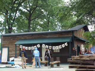
 I'm biased, deal with it. This one was the bestest! Way to go guys <3 <3. This is how it looked on Friday afternoon. 95% complete, which is just incredible. Besides being practically done, it looked fabulous! The overhangs were great, the colors matched perfectly. The details were starting to come together....
The craft table out front (with all the junk on it) was used for little kids to do actual crafts during the carnival. It was a big hit.
The inside had two big things that still needed to be done. Cloth was draped along the ceiling to cover the I beams and the ugly ply. And then astroturf was put down to be a nice plush grass under all the play watcher's feet.
By Saturday, it pretty much looked the same. I told them I thought they needed something else on the porch wall. One really awesome idea was adding some camp rules or list of activities. They didn't end up doing it - psh! my only critique.
The beach towels look good and I like the flag pole! The front and the sides still look beautiful! But they had for days, so not a surprise come Saturday.
Congratulations on a great facade ChiOBeta. And everyone else did pretty good too :)
I have some photos from awards that I'll post tomorrow, but that pretty much concludes the posts on Thurtene. You can read about wall raising here, then see an update on facade progress here and here.
Thurtene is one of those things that is impossible to explain to anyone. I find pictures do a much better job than words - so hopefully, those that haven't experienced Thurtene now understand it a little better.


No comments:
Post a Comment